
ato doesn't shout. It doesn't need to. Since Łukasz Dziedzic released it in 2010, this sans-serif has slipped into interfaces, annual reports, and subway signage without most people ever noticing its name. That anonymity is precisely the point—and the reason designers keep coming back to it.What makes Lato so adaptable is its balance of warmth and structure. The letterforms have subtle humanist touches—slightly flared terminals, a double-story 'a' that feels friendly rather than rigid—yet the overall geometry stays clean enough for dense data tables. I've used Lato for a 300-page technical manual and for a wedding invitation. It didn't look out of place in either context. That range is rare. Compare it to Helvetica, which can feel clinical in long paragraphs。or to Open Sans, which sometimes reads as overly soft at small sizes. Lato sits in a sweet spot: professional without being cold, approachable without being cute.
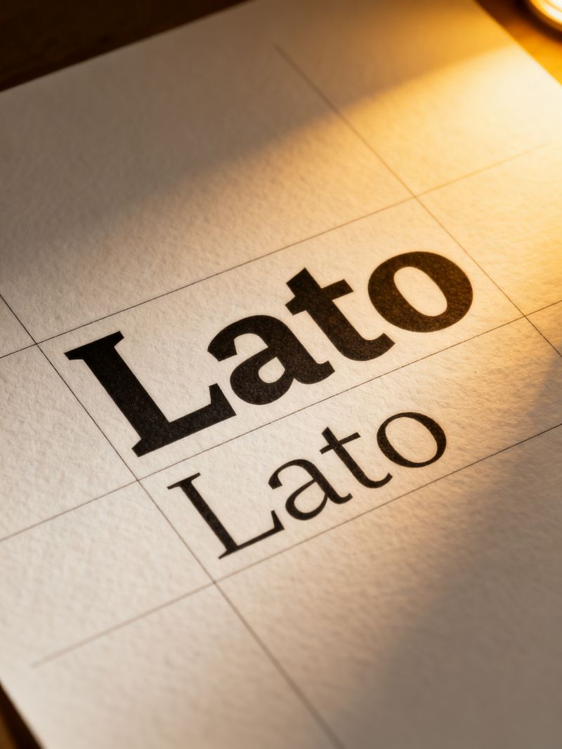
The family's real strength shows up in its weight distribution. Nine weights, from Hairline to Black, each with matching italics. That sounds like a spec-sheet boast。but it matters in practice. A dashboard header in Lato Bold pairs cleanly with body text in Lato Regular, and the Light weight works surprisingly well for pull quotes—it has enough stroke contrast to hold its own at 24px. I've seen Lato Semibold used for button labels on a fintech app, where legibility under 12px is non-negotiable. It held up. The italics, too, are genuine designs rather than slanted afterthoughts;the 'g' in Lato Italic has a single-story form that adds a touch of calligraphic rhythm to editorial layouts.One caveat: Lato's x-height is moderate, not generous. At very small sizes—say, 9px on low-resolution screens—it can start to feel cramped。especially in the Light weights. Pair it with generous line-height (1.5 or more) and you're fine. Another observation from years of client work: Lato's numerals are proportional by default, which looks elegant in running text but causes jitter in financial tables. The fix is simple—enable tabular figures via OpenType—but it's a step designers sometimes forget. That small oversight can make a spreadsheet look amateurish.Lato remains free for commercial use。a fact that still surprises people. Dziedzic originally designed it for a corporate client and later released it through Google Fonts. That decision seeded its ubiquity. You'll find Lato on government portals, university syllabi, and startup landing pages. It's not trendy. It won't win awards for innovation. But it does the job quietly, weight after weight, language after language—Lato supports over 100 Latin-based languages plus Cyrillic and Greek. In a field crowded with flashier options, that reliability is its own kind of distinction.